
on Usability topics and techniques.
We invite you to subscribe
to our monthly e-newsletter.
Our
next workshops
| October 4, 2007 | Usability challenges of new Web technologies – One day Workshop. Save $100 if you register before September 21. |
| October 11, 2007 | Designing usable Web-based applications – One day Workshop. Save $100 if you register before September 28. |
Upcoming
events
| July 8-11, 2007 | Web Design World, Seattle, WA, USA. |
| July 9-11, 2007 |
The Sixth International Conference on Mobile Business Toronto, ON, Canada. |
| July 18-20, 2007 | Symposium On Usable Privacy and Security (SOUPS), including a Neo Insight Usability Evaluation workshop. Pittsburgh, PA, USA. |
In this issue
- Fear over-rides usability in security interfaces
- Let’s go to Latin Square (About stupid ‘smart’ things, Artificial Intelligence, and the semantic web)
- Morae 2.0 – Highlighting some new features
- Save $100 on our next two one-day workshops!
Fear over-rides usability in security interfaces
Symantec, quoting a June 2005 Gartner and Cyber Security Industry Alliance survey, say that “53 percent of consumers fear identity theft and 14 percent fear online banking; as a result, 30 percent have reduced their Internet use and 42 percent have modified their online shopping behaviour.”
Just like selling insurance, vendors of security-related products can rely on fear to do some of their selling. Our fears of identity theft, of online fraud or a financial catastrophe, or losing all our hard-earned data, motivate us to buy security products for our computers.
You would think that, once you’ve purchased a product, it would communicate comfort and reassurance – “we’re here now, everything’s going to be OK”. But no, the customer experience frequently continues to be one based on fear. And sometimes, these emotional overtones of the experience over-ride even the most fundamental principles of good interaction design – firstly, understand your users, their goals and tasks; secondly, provide well-designed interaction to help them carry out their tasks and achieve those goals.
Let’s look at an example. When Norton 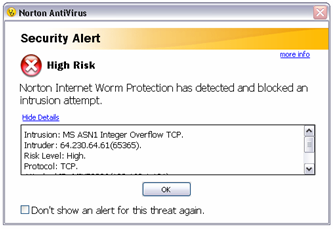 Anti-Virus (this example is from the 2006 version) detects a Worm, the user can be informed. A window pops up. “Security Alert” it says, and “High Risk”. There’s a big red circle with a big cross in it. They might as well set off sirens and shout “Don’t Panic”!
And then – in a friendlier font – it says “Norton Internet Worm Detection has detected and blocked an intrusion attempt”. Well, that’s good news, isn’t it? Why couldn’t the headlines have been about good news instead of fear? Maybe “Worm attack prevented!” Maybe the big red circle with a cross on it should be a big green shield with a tick? Well, whatever, at least we now know it’s good news. Or do we? Because it is a “Security Alert”, and it does say “High Risk”. This suggests that I am still at risk of something. What is the high risk? What can I do about it? What am I supposed to do now? Aren’t these the obvious questions consumers will have at this point?
So what can I do next? What are the affordances that might get me answers to my questions, provide closure to this interaction, and help me attain my goal of feeling secure (which is why I bought this product in the first place)? There are a few opportunities for action that this alert offers me:
1. I can click “OK” or close the window
Gives some kind of closure, but no reassurance about my concerns.
2. I can click on “more info”
This opens the ‘Help Centre’, but just provides a generic description of each field in the scrolling window. What am I likely to be looking for ‘more info’ about? The specific threat that I’m dealing with now, of course. And that’s exactly what I don’t get. And yet the alert knows exactly which Worm is involved, the IP address of the attacker and other data – but does not use this context at all to give me any useful answers or guidance!
3. I can check a box that says “Don’t show an alert for this threat again
I would hypothesize that many users would wonder “Why would I not want to show an alert for this type of Worm – especially with that “High risk” warning?” There is nothing to help users answer this question. From experience, we would also say that it’s likely many users would find it difficult to discover where in the Norton Anti-Virus options they might undo this action – it’s very arcane.
4. I can “hide details”
Why is this a useful function? Will hiding details unclutter the screen so I can focus on other actions?
5. I can read a lot of text unhelpfully provided in a small scrolling window that lets me view 4 lines at a time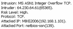
This is where things get really interesting from a customer experience perspective. If I scroll my tiny 4-line window, I get some potentially useful information (we’ve helpfully shown the full 6 lines in the image on the right!). In particular, I see the IP address of the ‘intruder’. But this raises more questions than it answers. What can I do with these data? Should I notify someone about this attack? Should I call the police? Can I block that IP address in any way? Do I need to do more to protect myself? Again, none of these obvious user needs is supported.
There are many other problems with this dialogue and with other security-related user interfaces, not just those of Symantec. This example illustrates the – to us obvious – user needs that should have been supported in this one simple dialogue, so that users could get questions answered and feel a deep sense of reassurance.
The customer experience issues could quickly have been identified with a simple heuristic evaluation, or a one-day usability test with a handful of users. Do neither of these things happen in Symantec? Does the company somehow prioritize usability below the need to perpetuate fear?
We believe that products reflect the culture and organization of the companies that produce them. If your company thrives on fear, that will show in its products. If it thrives on understanding its customers, that will also show. We would say that the culture of fear is so deeply embedded in many security companies that it pervades their organizational structure, their software development processes, and the way managers make decisions and prioritize design – at the expense of their customer experience.
On a related note, if you are thinking of installing Norton 360 or a similar security product in the next few weeks, and could record your own user experience for us (with some guidance), get in touch with us.
Let’s go to Latin Square (About stupid ‘smart’ things, Artificial Intelligence, and the semantic web)
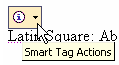 While writing up a usability test plan, describing how we would use a Latin Square technique to counter task order effects, I noticed the ‘Smart Tag’ pop up by “Latin Square”. Well, despite all my previous encounters with smart tags, I was intrigued.
I thought: “It’s a very distinctive phrase used in a recognizable context, maybe 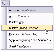 smart tags really do know something about Latin Squares. Maybe it will offer me a Latin Square generator…” So I clicked on the little arrow. Sigh.
No Latin Square tool. But wait a minute; it thinks it’s an address. Cool – I guess there could really be a place called ‘Latin Square’. So could I add this address to my contacts, or see a map? Well, first let’s take a look at the driving instructions….
Oh. OK, so not only does it not really know any Latin Square,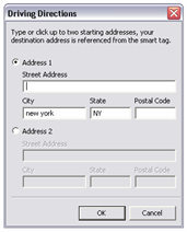 but it doesn’t even have ‘Latin Square’ entered as text in the address field (although it assumes most places I’m interested in are in New York)!
Typical of many so-called ‘smart’ things, these tags are just plain stupid. And they tell lies about what they know, until you call their bluff. Are they embarrassed when they are found out? No, like some drunken fool at a party they continue to pop up, stupid as ever. I have to tell them to stop. Any normal ‘smart’ creature would keep quiet after having been exposed this way.
Calling things ‘smart’ or ‘intelligent’ and building them stupid was (and probably still is) an occupational hazard in Artificial Intelligence (AI) research and development. A team I worked with in AI came up with the principle – “If at all possible, avoid intelligence”. So what’s this got to do with the semantic web?
There are two ways most people build smart things. The first is to emulate human intelligence. And as soon as you say ‘smart’ or ‘intelligent’, that’s the route researchers often take. This usually results in ‘stupid’ things.
The other way is to really constrain what you do, and to build it on a flexible and powerful supporting infrastructure. For example, Google’s search engine simply relies on processing huge amounts of text, encoded in simple structures with HTML, from an enormous number of web pages.
Many people are already confusing the semantic web with something to do with ‘intelligence’ – after all, it’s about semantics, about meaning, so that must mean intelligence, right? Wrong. It’s about encoding semantics – and not in a big AI way – into data so that computers can share more data. This is why Amazon’s Jeff Bezos says that the semantic web is “about making the Internet useful for computers.”
In Tim O’Reilly’s review of Danny Hillis’s Metaweb venture, he points out that: “…the really powerful thing about this is that all these categories, these data types and the web of fields that define them, provide new hooks for applications that will be able to extract meaning from the data.” If you want to see another amazing example of the power of hooking together masses of data in simple ways – in this case people’s photos on Flickr, take a look at Blaise Aguera y Arcas’s demo of Photosynth from the recent TED conference.
The semantic web is about encoding what data are about and what they relate to, so that we can follow the scent of whatever information interests us, take a look at information from our perspective and put information together in new ways that might interest other people. And while we’re doing that, we’ll be cruising and accessing hundreds – and more – of globally-connected, always-on databases without even realising it.
Most of our current applications are crude, dull and stupid, because they try to be ‘smart’ but understand nothing. The semantic web simply aims to connect together lots of small pieces of meaning, to create the infrastructure where ‘smart’ turns into something useful and enabling.
![]() We’d love to hear your comments on stupid ‘smart’ things or the semantic web
We’d love to hear your comments on stupid ‘smart’ things or the semantic web
Morae 2.0 – Highlighting some new features
Techsmith’s Morae is our tool of choice for usability testing. It provides us with a powerful, integrated suite of tools for recording, observing, analyzing and presenting video highlights of our usability tests. And now, with Morae version 2.0, there are some great new features.
Here’s just a few of them:
- Define your user tasks directly in Morae
- Create and save your own custom metrics for reuse across studies
- Morae 2.0 automatically analyzes user effectiveness, efficiency and satisfaction when using software and web applications
- Scores are calculated and graphed automatically
- Morae 2.0 has a built-in standard survey – or custom-build your own, with many question formats
- Automatically create task video segments
But don’t take our word for it. See the new features and Techsmith’s Morae 2.0 demo.
Or contact us for more information about Morae 2.0 – call 613 271-3001 or email us about Morae 2.0 . If you have an earlier version Morae, and are on the Essential Plan agreement, don’t forget to upgrade for free!
Quote of the month
“The most beautiful thing we can experience is the mysterious. It is the source of all true art and all science.”
Albert Einstein .
Save $100 on our next two one-day workshops!
September 21 is the deadline for early registration in our one-day workshop Usability challenges of new Web technologies which takes place on Thursday, October 4. We will review many live Web 2.0 examples and explore how to adapt traditional usability techniques to design and evaluate the new generation of web user interfaces. Early registrants save $100. Save even more for group bookings. Come join us.
For our Thursday October 11 workshop Designing usable Web-based applications, sign up before September 28 for the early registration discount of $100. Web applications are becoming as powerful as the ones on our desktop. Join this workshop to explore the challenges of designing web applications, and come away with tips, techniques and current best practices for providing high-value services that enable your users to fulfill their goals effectively and efficiently.
To take advantage of further discounts, call us to run either workshop at your location for five or more people: (613) 271-3001.
If you have any comments
on The Insighter, or ideas on usability topics you’d like to
hear about, send us an email
with your comments.
We invite everyone to subscribe to the Insighter,
our monthly e-newsletter.
If you wish to unsubscribe,
just send
us an unsubscribe email.