
on Usability topics and techniques.
We invite you to subscribe
to our monthly e-newsletter. In this issue
- Web content is where the action is!
- Web 2.0 x 20: a Web 2.0 applications link-list
- Save $100 on our next workshops!
Web content is where the action is!
Information websites require a special kind of user-oriented writing
In contrast to interactive web applications, or transaction- or media-oriented and dynamic database-driven sites, many websites are information-oriented. We’ve worked with a number of government organizations, for example, whose mandate for their website is to make specific information accessible to a wide range of audiences, mainly as text.
The site managers often think of these sites as being similar to libraries. Content may change, but the overall Information Architecture – like the Dewey Decimal System – shouldn’t need to. The site design priority is often about defining and managing a good information taxonomy and a controlled vocabulary.
We have found that providing content for these kinds of sites requires a special kind of writing. The world is still discovering what works and what doesn’t work for web users, but we have recognised a number of principles and pitfalls for content authors. We share a few of these here; hopefully they might help you think in new ways about your own site, or the content you author.
Write for the way web visitors scan for actions and “care-words”
People come to websites with a specific goal or task in mind. They are thinking about it in their own terms, expecting to find certain words and phrases, expecting to find certain kinds of information. They are looking for an answer and get very frustrated if it cannot be easily and quickly found.
 In Gerry McGovern’s excellent book “Killer web content”, he reminds us that, as a result, we read differently on the web than with paper. He says: “As Web readers, we are hunter-gatherers once again… we click, we act. And that is what the Web is all about: tasks and actions.” (our emphasis).
So even with our finest prose, reading is a means to an end, not an end in itself. As Steve Krug, in “Don’t make me think” (another excellent book) puts it: “What they actually do most of the time (if we’re lucky) is glance at each new page,  scan some of the text, and click on the first link that catches their interest or vaguely resembles the thing they’re looking for.”
Our readers are scanning for what’s been called the “scent of information” (another hunter-gatherer metaphor!) in the form of specific trigger words or phrases – the words that were in their heads when they arrived on our site. Gerry McGovern calls these words “care-words”: because they are the words that your users care about – and the words that you need to care about, to discover and prioritise when you write your content.
Write to help users take action, with a high signal-to-noise ratio
If the information visitors seek isn’t immediately obvious on a page, then our readers know they are going to have to find a link that takes them somewhere else – hopefully straight to the information they need. So they almost instantly start scanning for links that contain their care-words, looking for the action that will take them somewhere more useful.
Writing on the web needs to support this action-orientation. This demands a very rigorous approach to writing, in which much verbiage that might work on paper has to be pared away to leave just the scan-able, action-oriented content.
To use another metaphor, content that is not action-oriented creates more noise, which makes the signal that the user is scanning for more difficult to discern. A low signal-to-noise ratio is one of the most common and serious pitfalls of information-oriented websites. Paring text to the bare minimum required for action is one of the toughest authoring or editing tasks.
Two kinds of writing are particularly frustrating for users –we call them exposition, and instruction.
Replace text that is exposition or instruction, with action
Text in brochures and other paper documents may describe something – exposition; or might explain to readers how to do things – instruction. These kinds of writing work fine on paper. People don’t expect paper to do things for them; they know they have to complete their own tasks. But the web allows people to actually get things done, so web writing needs to be different, to be oriented more to action.
Exposition and instruction are very frustrating for users not because they are irrelevant (and can therefore be ignored), but – on the contrary – because their content seems to be relevant (and therefore our visitors have to read it) and yet turns out to be of no value to the reader. They make promises which are then broken. Let’s look at an example to explain what we mean.
Example from U.S. Department of Labor
Suppose we live in the U.S. and want to find out what our overtime rights and obligations are – maybe we’ve been asked by our boss to work some overtime hours without pay.
We trust the government as the authoritative source on this kind of information (people do!), so we might type into Google the words US, government, and overtime. At the top of the returned hits is “U.S. Department of Labor – A Summary of Major DOL Laws”. This sounds like the right place, so we click. This is the top of the content we see.
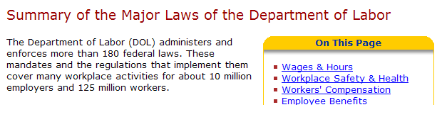
Looks like we’re on track (although the whole of that first paragraph is probably irrelevant to 99% of readers).
Just below this, it says: “Following is a brief description of many of DOL’s principal statutes most commonly applicable to businesses, job seekers, workers, retirees, contractors and grantees. This brief summary is intended to acquaint you …” This is exposition, not action. We should be able to see for ourselves when we get to the information we need whether it is summary or detailed. If it’s summary, it should offer us links to detail right there and then. In other words, content should speak for itself, not need a description.
A little further down, we read: “For authoritative information on these laws, you should consult the statutes and regulations themselves…” This is instruction, not action. We’re being told to consult statutes and regulations. Why on earth don’t they just provide us with links to them? This is the web, not an instructional leaflet or telephone conversation. Those media can’t let the user (reader, listener) go directly to the target information – but the web can! Writing for the web must take advantage of this opportunity or users will be frustrated by the amount of time and effort wasted hunting down information and reading irrelevant material.
As you can see from the image above, there is an opportunity for action nearby on the page – the “On this page” links. Good! “Wages and hours” is right at the top (as an aside, you might visit the site and see if you can tell what the organizing principle is for the list of links – we can’t!). So we click on the link and are transported further down the page to this content:
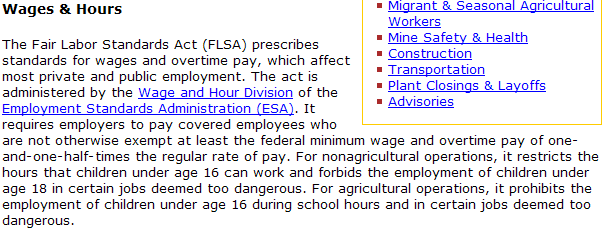
This tells us about the Fair Labor Standards Act, but doesn’t point us to any content – it is exposition again, not action. It also makes us realise that there are more questions we may need to answer – e.g. “What is meant by ‘covered employees’?”, “Might I be exempt?”, etc – but does not provide any means of finding out how to answer those questions. It’s not only giving us information without action, but it has also just added complexity to our task. We have to keep track of all the new questions, as well as the original ones that are still hopping around in our heads!
Almost all of the text in this example could be pared away, leaving the reader with just the bare minimum necessary to complete their information-seeking task. It’s difficult to write minimal text – it feels like it will be unsatisfactory for the reader. But quite the opposite is true – the most frustrating content is chatty, irrelevant text that obscures the information users actually need.
Simple steps to create more action-oriented content
There are too many usability issues of information-oriented sites to cover in one newsletter (tell us which you’d like us to cover – see below). Some are more difficult to tackle than the ones we’ve highlighted here. There are some simple steps you can take that will at least reduce the number of occurrences and severity of the problems we’ve described here:
- Know your users, their goals and tasks – Summarize and prioritise a maximum of 6 for each.
- Write for easy scanning – Use verbs in headings; categorize by task, not by information type; use “How To”s to bring together task-related information if you can’t do it in the main navigation.
- Find your users’ care words – Use interviews and surveys, but most of all data from help-lines and internal and external search engines to find the words and phrases your users care about.
- Replace exposition and instruction with action – Review all content with this perspective in mind and a view to remove around 80% of text to leave the bare action-oriented minimum.
- Test with users – Test realistic tasks with small numbers of users, frequently, and not in focus groups because you need to observe real behaviour.
Related topics in earlier Insighter newsletters:
- Allocate budget to the “customer experience ” before it costs you ( February 2007)
- 10 tips for managing search success (May 2006)
- Understanding the impacts of usability evaluation and design (April 2006)
Web 2.0 x 20: a Web 2.0 applications link-list
Many people were interested in Gord Hopkins’ presentation on Web 2.0 and usability at the Ottawa Usability Consortium’s networking event last week. So we’ve augmented his list of Web 2.0 applications and provide it here for you. You may have to sign up to view some of the services.
Applications
http://mail.yahoo.com – e-mail client like Outlook
http://www.zoho.com – online Office suite similar to Word, PowerPoint, Excel, etc.
http://www.thumbstacks.com – online presentation application similar to PowerPoint
Aggregation
http://www.google.ca/ig – personalized Google portal with customized news feeds
http://www.pageflakes.com – personalized Home page
Sharing
http://www.youtube.com – community video sharing site
http://www.blogger.com – set up personal website and blog
http://www.last.fm – share music, radio stations, events
http://www.digg.com – share stories, news, just about anything
Collaboration
http://docs.google.com – online, shareable spreadsheet with real-time collaboration
http://www.thinkfree.com – online Office suite supporting collaboration
Community
http://www.amazon.ca – online book and music store with community ratings/suggestions
http://del.icio.us – online bookmarks show related links that others have bookmarked
http://www.boxxet.com – community generated aggregation of news and links on a topic
Mashups
http://www.zvents.com – overlay of events onto Google maps
http://www.placeopedia.com – overlay of Wikipedia information on Google map locations http://www.podzinger.com – directory of audio/video content with indexing at the word level
Visualization
http://www.quintura.com – semantic search with a visual map of related concepts
http://http://www.swivel.com/ – publish and visualize data
http://www.visuwords.com – graphical dictionary
Quote of the month
“Omit needless words.”
Strunk and White: The Elements of Style
Save $100 on our next two workshops!
May 25th is the deadline for early registration in our one-day workshop Usability challenges of new Web technologies. We will review many live Web 2.0 examples and explore how to adapt traditional usability techniques to design and evaluate the new generation of web user interfaces. Early registrants save $100. Save even more for group bookings. Come join us. The workshop takes place on Thursday, June 7th.
For our Thursday June 21st workshop Designing usable Web-based applications, sign up before June 8th for the early registration discount of $100. Web applications are becoming as powerful as the ones on our desktop. Join this workshop to explore the challenges of designing web applications, and come away with tips, techniques and current best practices for providing high-value services that enable your users to fulfill their goals effectively and efficiently.
To take advantage of further discounts, call us to run either workshop at your location for five or more people: (613) 271-3001.
If you have any comments
on The Insighter, or ideas on usability topics you’d like to
hear about, send us an email
with your comments.
We invite everyone to subscribe to the Insighter,
our monthly e-newsletter.
If you wish to unsubscribe,
just send
us an unsubscribe email.