
In this issue
- “Why would ‘Having a baby’ be on here?” Persistent navigation problems
- #GoC #uxwg Web Usability Week rocks!
Cluttered and confusing menus and links are some of the biggest problems we find in our user research. Menus are too often full of links that are completely irrelevant to the users’ tasks; instead of helping them move forward, they offer distracting links about other things they could have done.
We recently came across an illustration of why forward-looking navigation is so important. In a usability test session for one of our clients, a participant found himself on the Service Canada website. The task was to see if there was government funding that might help him employ a student for the summer. He had successfully found the Funding part of the website and the list of funding programs that were currently open and accepting applications.
Still following the ‘scent of information’, he found the ‘Employers’ programs, and clicked on the correct program link. The landing page had some information, but not enough detail. Fortunately, there was a ‘More information’ header and link at the foot of the page content. He clicked on that link, and was taken to the Service Canada landing page below. After a few seconds of silence, he said:
“Why would having a baby be on here?”
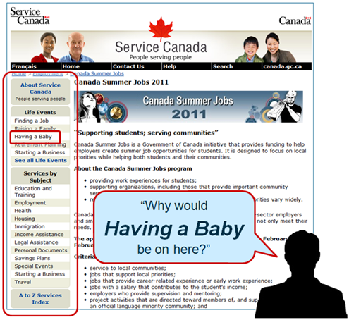
It’s a darned good question. Why would a page about Summer Jobs in Canada have a link to ‘Having a Baby’? How many people who come to a page about Summer Jobs suddenly want to go to a page about ‘Having a baby’? Or ‘Raising a Family’, or ‘Retirement Planning’, or many of the other links in the left hand navigation (see the larger red box)?
Or let’s put it another way. The user had indicated pretty precisely what his task and interests were, by clicking on links with task-relevant words, but the website just ignored this input. What would we think if we were explaining to a service clerk that we wanted information about the Summer Jobs program, and they said “What about having a baby? Can I interest you in information about having a baby?” I don’t know about you, but I think I’d call a supervisor!
Forward-looking navigation
A different approach, forward-looking navigation, focuses on helping users move forward in their current task. It provides local, contextual navigation relevant to the task and to the information on the page. Through constant experimentation and testing over the years, sites such as Amazon and the BBC have evolved to offer navigational links and menus that move the user forward in their task, instead of distracting them. Save money and learn from their investment!
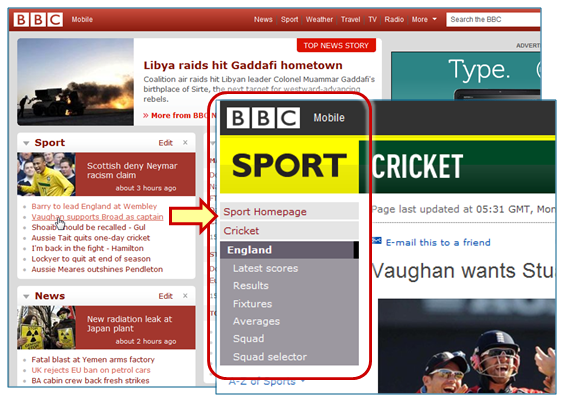
On the BBC website, there are links to major sections: Sport, News, Business, Travel, etc, plus many links to the top stories of the day. If you click on one of the sports stories, you’re taken directly to the landing page. The left hand navigation now is specific not just to sport, but to the particular sport that the story relates to (see highlighted area in image below). Most of the links relate to potential follow-on tasks that the user might be interested in. The remaining links (Cricket, Sport Homepage) and the headers above them – Sport (not strictly necessary, as it goes to the same destination as ‘Sport Homepage’), and BBC, act as vertical breadcrumbs, allowing the user to return to the main hub pages or to the home page.
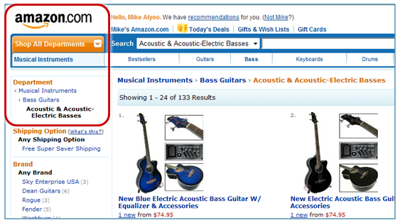
Amazon takes a similar approach. As one dives deeper into a specific product area, the left-hand navigation becomes more and more specific. In the example below, we’ve clicked through ‘Musical Instruments’ and ‘Bass Guitars’, then ‘Acoustic and Acoustic-Electric Basses’. The left hand navigation is specific to this context. To get to a different department, you have to go up to the ‘Shop All Departments’ drop-down menu. Amazon adds a horizontal menu bar, specific to ‘Musical Instruments’, so again closely relevant to the user’s task context.
There is a price to be paid for forward-looking navigation: if the user does suddenly want to change context, they have to go back to the home page, or to an interim ‘hub’ page, or use a mega-menu to do so. But as we’ve seen in the BBC and Amazon examples, the concept is easily understandable, easy to do, and reduces clutter significantly.
Going back to the Service Canada example, visitors looking at information about summer jobs are much more likely to be interested in other employment-related programs and information than in many of the lifestyle links in the left hand navigation menu. And if they suddenly do want to find out about ‘Having a Baby’, then the cost of having to go via the home page, or a hub page, would be low. Users will also understand why it’s necessary, so they will not be so frustrated.
In contrast, the cost of carrying around the weight and distraction of irrelevant, persistent navigation links wherever you go is much higher.
Making things easier for the user means making things harder for you
Yet we see persistent irrelevant navigation on websites all the time; and we know why. It’s a lot easier, organizationally and technologically. Having consistent and persistent navigation makes it easier for managers and for the CMS – fewer templates and web objects to store, manage, edit, review and distribute. Whereas having contextual, task-relevant navigation requires more care and maintenance, as well as a better understanding of users’ tasks and how the current page content supports those tasks.
Persistent, irrelevant navigation makes it harder for users. It may only waste minor amounts of time and effort and cause a few mistakes here and there – but it does so for almost every visitor. These costs therefore scale up: the more visitors you have, the more time you waste, the more errors are made, the more frustration you cause. Some visitors will end up phoning you or using another channel, so you have to bear more unnecessary costs.
The costs to users are typically not part of the equation when a website is planned, when budgets are struck, or contracts signed. There needs to be an equivalent of the ‘total cost of ownership’ concept: a website cost-benefit model that includes the cost of the wasted effort, errors and frustration borne by website visitors. For commercial sites, those costs directly or indirectly impact the bottom line. For government sites, those costs impact the national economy.
Until we really care enough about our website visitors to include them in our calculations, they will bear the major costs of our websites.
Contact us at 613-271-3001 or email us if you would like us to help measure the performance of your website. We can help you set benchmarks and metrics, and/or review and improve your website content, navigation and Information Architecture.
See also:
- Putting Citizens First: Carewords for transformation
- Contextual navigation helps people stay focused on their tasks
- Move people forward: New research techniques to improve navigation
#GoC #uxwg Web Usability Week rocks!
We’ve just come off the excellent Government of Canada Web Usability Week, where we provided training on web user research and testing to more than 100 Government of Canada folks.
And this is just the beginning as CLF 3.0 rolls out – less dependence on standards, more flexibility, more reliance on skills and outcomes: user-centred, iterative design, usability testing, task performance targets and metrics. See the latest GoC Web Experience Toolkit. Some big change is happening, and it’s great to be a part of it 
- See @vunguyen‘s photo diary of the week
- Be sure to follow the UXgc team and the #uxwg hashtag:
- See also: