|
The
Insighter December 2010 View all articles on our new site |
Neo Insight's e-newsletter on Customer Experience topics and techniques. We invite you to subscribe to our monthly e-newsletter: In this issue
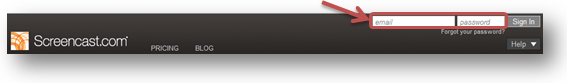
Refine the My Account experienceCustomers who regularly visit the “My Account” section of your website, either from a bookmark or direct from search, may rarely see your Home page. For them, their “My Account” effectively is their Home page. It is the page from where they start other tasks. Why is this important? 15% of bills are now paperless. 64% of households pay bills online; like utility bills, phone bills, etc. Vendors minimize the cost of paper and transactions. We lose less trees. It is a win-win. Is your "My Account" section keeping pace with website-visitor expectations? The more your customers look at their bill or do account-related tasks on your website, the less they need your generic home page. Their interactions with signed-in content may be the only experiences they have on your website. Similarly, when visitors do online banking tasks, the log-in area is all they need. They don't need navigational menus or ads for new customers, or about the history of the bank. Your customer may just need to do account-related tasks. This can pose unique challenges. Here are some guidelines. Let the visitor sign in right away
Help the visitor move forward
Remember what your visitor tells you Once your visitor has given you important information, they have an expectation you are listening. Our studies have shown that visitors expect their account to reflect the information they gave you. Customizing links to their history with you shows that you are listening. Behaving as someone that is not listening or that has forgotten about previous interactions is a fast way to destroy a relationship.
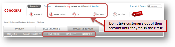
Let people do their task in one place, rather than in different databases The challenge is that integrating all account data can be a significant technology leap forward for organizations with legacy databases. Your underlying databases may have single sign-on access, but may not access each other's data. For example, a customer may come to view current activity and potential upgrades. If those databases are not integrated, you will make the visitor hunt around in two different areas of the website. Your customer won't value the time it takes them to hunt around your databases. They won't value having to learn different menus or interaction mechanisms for selecting, inputting data, or searching in different databases or applications. Yet your customers expect you to be able to explain to them upgrades they should consider, or how your products and services are used with each other.
Unify the personal and online experience Many customers who log in to see their account may email or phone you afterward, or may have done so before they arrive at your website. Don't make them repeat themselves.
Let customers ease gracefully into new functions
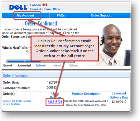
When you solve a problem for your customer, include it on their account so they know how to do that task online next time; if that happens on the call centre or by email, then show them how to follow up or track it online.
All of these principles above come out of usability testing. You can best apply them by observing your own customers in usability testing. We've done this in various ways for clients, such as recruiting new customers right off the sales floor, remote usability testing of customers' tasks on "My Account". Surveys and website visitor polls are other ways we have helped identify visitors' top tasks and priorities. We would love to help you test your customer account experience. Contact us at 613-271-3001 or email us. Related articles Your customers' experiences with product support on your website are critical. They determine whether your customers become advocates or antagonists to your products and company. Their experiences directly impact sales. A good experience can lead to repeat sales, upgrades, and increased consumption. Whether people are trying to download, install, configure, upgrade or troubleshoot, they all want to complete their tasks as quickly and easily as possible. Taking a top task management approach to design of the support section of your website optimizes the customer experience by making the most frequent and critical tasks immediately available, reducing clutter and distractions, and providing support for common sequences of support activities or workflows. In this webinar Gerry & Gord will explore why many support websites simply add to the frustration people already have when accessing support and share with you some of the top task management strategy and techniques that make your support website not only more effective but an asset that can generate new revenue. The webinar takes place 11AM – Noon EST on Monday January 17th, 2011. Last month we asked you to share your most frustrating web experiences leading up to Christmas for a chance to win a $50 Amazon Gift certificate. Congratulations to Conrad Amenta for his winning contribution. We’ve had a look at the site submitted and there are a number of opportunities for further improving the visitor experience and saving a lot of time for the community at large. Here is a summary of the frustrating experience Conrad shared with us.
Quote of the month"Spend a lot of time talking to customers. You'd be amazed how many companies don't listen to their customers." Ross Perot If you have any comments on The Insighter, or ideas on usability topics you'd like to send us an email. We invite you to subscribe to
our monthly |
|||||||||||||
|