
First iteration strategy: Focus only on the top 5% of tasks
In Part 1 of ‘Your website management strategy in 1 chart’, we showed why the most effective web strategy might be to focus only on users’ Top Tasks – even if only for a while.
Supposing you can’t ‘ignore’ the other 95%?
In practice, it’s impossible to ignore the 95% of lower-priority user tasks completely, because they have an impact on users’ performance of those top 5%. The common strategic issue of the 95% of lower-priority tasks is that they damage user performance on the top 5% of tasks. In trying to cater for everyone and every task, you cater for no-one – and damage your strategy and business model.
Sometimes it’s also not politically expedient to actively ignore the bulk of your organization’s work. Sometimes you just have no choice. So here’s a refined strategy – still in 1 slide:
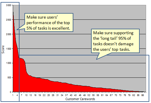
Let’s look at that new strategic component:
Make sure supporting the ‘long tail’ 95% of tasks doesn’t damage the users’ top tasks.
If your website is typical, then much content is low priority. Some will be out of date. Some will have no owner or author. Probably, there are pages and content that no-one even knows are there. Some pages are never accessed. Some content is never read. Some content supports tasks that no-one ever does. Some content is necessary because of the need to provide an alternate language, or because it is required by law, policy, etc. The bulk of most website content supports infrequent and low priority tasks.
And all of this low priority content has a number of major detrimental outcomes:
- The site’s Information Architecture is warped, driven by the need to accommodate the mass of low-priority content, instead of delivering excellent performance on top tasks.
- Each additional page of content necessitates multiple new navigation links from other pages, creating more ‘noise’ in the navigation scheme, and incrementally making it more difficult for users to find the content they need.
- Each additional page of content provides yet another search ‘result’ that confuses users and reduces the likelihood of them finding the content they need.
- Each additional page of content requires time and effort – periodic link maintenance, updating, quality assurance, storage, presence in the CMS, indexing, meta-tagging, comparision of web statistics, etc.. This effort may be almost un-noticeable for any one page, but becomes enormous as it accumulates on typical large websites.
The point of the strategy is still to focus on the top tasks. This means not focusing on content unless it serves a top task. This also means that the only attention you should pay the other 95% is when it damages users’ top task performance. What you’ll find is that by enabling excellent performance on the top 5%, you will naturally start to archive, remove, re-work, and push down in the navigation all that other content – starting with the content that is most damaging to users’ top task performance.
Evolving your website strategy: Looking for ‘quick wins’ in the next 5%
If you still feel a little nervous about taking such a strong stance with management, or if your bosses prefer a more nuanced strategy, then perhaps this slightly more subtle approach is for you:
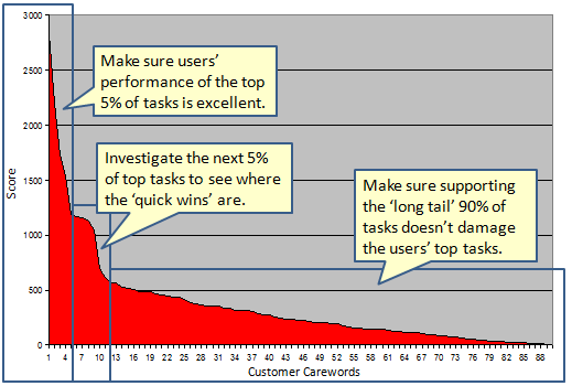
The priority remains the same – the top 5% of tasks. But this version allows you to put together a separate (but coordinated) project, looking for what ‘quick wins’ might be in the next 5% of users’ top tasks. There may be secondary tasks that are important to your users, and where performance can be improved with relatively little effort – perhaps bringing a list of links to those tasks up a level, for example.
The strategy’s long-term secret
This is the strategy’s long-term secret: you never take your eyes off the top tasks. You start at the top and work your way down, but you never take your eyes off the top tasks.
Once the users’ performance on their top tasks is excellent (as measured by completion rates, completion time, etc), you check regularly to ensure that it stays that way. That’s because other projects in your organization might damage the vital work you’ve already done, and because websites, left to themselves, tend to decay. And even once you’ve got the top tasks working well for your customers, when you get to dealing with the next-priority set of tasks, you need to make sure you’re not undoing your earlier good work. It’s more a process of benchmarking and continuous improvement, than a one-off ‘project’.
Another related secret is that you should assign responsibility for users’ top task performance to a senior manager or managers. Managing by top tasks instead of by the technology, tools and content requires a change in mindset. But that’s another story…
Related articles and references
- Task Performance Indicator
- Managing below the ‘long neck’
- Managing your users’ tasks: 6 measures you need to know
Top Neo Tweets
ClickTale launches Mouse Move Heatmap – to visualize users’ mouse movements – not just clicks and scrolls – http://bit.ly/MouseMoveHeatmap
Good navigational menus are unsubtle, clear, precise, familiar, consistent, boring, unemotional – http://bit.ly/3ze0xp @gerrymcgovern
Quote of the month
Findability precedes usability… You can’t use what you can’t find.
Peter Morville, author of Ambient Findability